
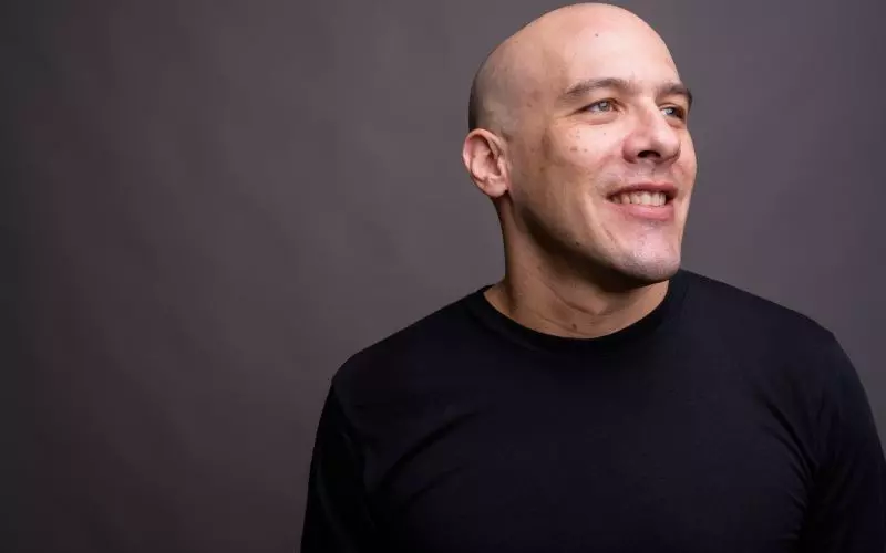
Every design now has a grayscale switch. On, and the whole site renders in black and white: photographs, accents, everything.
The practical reason, which is the real one
Most actors have photographs from several sources. A headshot from one photographer, production stills from three sets with three different color grades, a phone photo from a festival. Put them in one gallery and they look like they were collected rather than chosen, because the colors do not agree.
Converting everything to black and white removes the disagreement entirely. It is the fastest available fix for the most common visual problem on an actor website, and it costs one click.
The aesthetic reason
Black and white reads as serious. There is a reason theater programs and film posters use it. It also directs attention to face and expression, which is what a casting director is looking at anyway.
The risk is that it can read as cold, or as a stylistic choice made in place of a decision. If your work is warm, comic or commercial, full color probably serves you better.
What it does not do
It does not alter your files. Your originals stay in color, so switching back is instant and downloads are unaffected. Print-ready downloads, covered in print-ready headshot downloads, always serve the original in color.
Partial options
You can apply it to images only and leave the rest of the site in color, which is what most people who try this end up preferring. That gives you consistent photographs and keeps a single accent color for links and buttons, which is what the color scheme picker is for.
Where it works best
Modernist, unsurprisingly. Also any design where photographs dominate the page, such as the gallery-led templates discussed in multiple photo galleries.
Related: background textures and font choices are the other two low-risk ways to make a template feel like yours.
Create your free actor website and try it on your own photographs.
Finished reading? Build yours next.
It takes about 76 seconds and it starts free, with your credits, headshots and reels already in it.
Build mine free→